|
อันนี้ เป็นคำตอบครับ
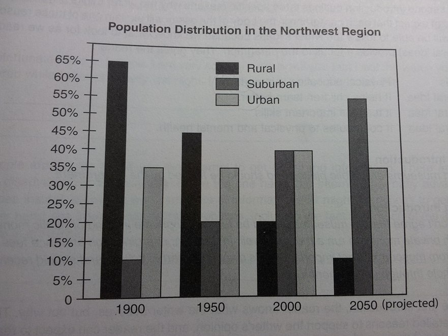
The bar chart represents how people are distributed in the Northwestern part of the USA from 1900 to 2050. In general, it indicates the declining pattern of rural population over the period in contrast to a sharp rise in suburban residents.
People living in rural areas made up the majority of Americans in the Northwest from the early to mid 20th Century although their proportion was declining constantly. Also, it is evident that in the year 2000 the rural part was for the first time less populated than the suburban and urban areas. At that time, approximately 1 out of 5 people resided in the country while the rest of the population was equally distributed between the suburb and the city, representing 40% each.
Despite the changes seen in the proportion of rural and suburban residents, the percentage of city dwellers remained stable over all these years at 35 40%, and the projection is that it will stay at this level through 2050.
It can be concluded from the graph that if this pattern continues, the year 2050 will be characterized by the highest population in the suburb and the lowest in the rural areas.
| จากคุณ |
:
JM2p 
|
| เขียนเมื่อ |
:
18 ธ.ค. 55 21:51:07

|
|
|
|
|